- home
- the basics
- the share
- trading shares
- Process to buy shares
- Why buy shares?
- How old to buy shares?
- Custodial account
- tax rules on shares
- styles of trading
- buying (going long)
- Shorting (going short)
- Stop losses
- How to choose a share
- Fundamental analysis
- Technical analysis
- Stock portfolio
- Trading courses
- Stock trading practice accounts
- brokerage account
- What is trading software
- Share newsletters
- the stock market
- Trading guide
- Advanced
- Glossary
- free stuff!
Stock price chart explained
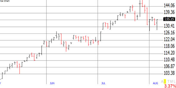
A stock price chart is used by stock market traders as part of their technical analysis of a share. The charts simply display where the stock has been, in terms of price, over a time frame (which you can set). Each bar on the chart usually represents a day, however you can change the time frame of the bars to a minute, hour, day, week or month etc.
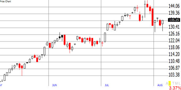
When viewing a chart, traders normally chose between two ways to view the chart, they use either use OHLC bars (open, high, low, close) or candlestick bars.
Stock Chart Example 1
Apple | May 2007 – August 2007 | OHLC chart

Stock Chart Example 2
Apple | May 2007 – August 2007 | Candlestick chart

Stock Chart Example 3
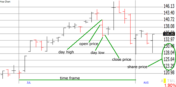
Apple | May 2007 – August 2007 | OHLC chart close-up
If you take a closer look at the OHLC chart, the day in focus in red. This is because the close price finished lower than the open price.

Stock Chart Example 4
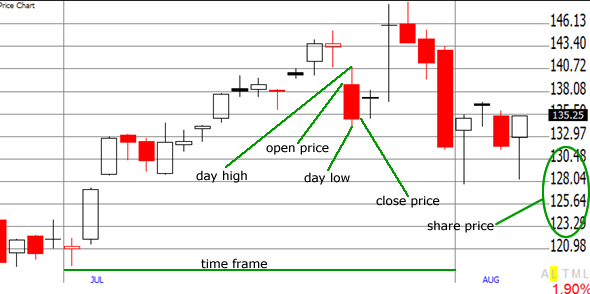
Apple | May 2007 – August 2007 | Candlestick chart close up
As with the OHLC graph, the day in focus on the candlestick graph is also red. This is also because the close price finished lower than the open price. The candlestick graph just provides a different visual way of looking at a chart. Choosing between a OHLC chart or a candlestick chart is purely a matter of visual preference.

Stock charts are fascinating once you learn the many different types of trading patterns that appear and know the indicators that pretty much tell you when to buy! If you think the charts look complicated you are mistaken, it only takes a little time and practice to understand what they mean.
If you are serious about trading stocks and want some hands on experience using charts, then there is a great free website that is recommend – freestockcharts.com
Or you can use MarketClub’s really amazing charting tools and signup for a free 2-week trial to also get some free training on technical analysis.
Screen shots courtesy of tc2000
4 Responses to Stock price chart
Leave a Reply Cancel reply
Practice Trade!
SharesExplained.com
- Loading Quotes...
Free newsletter and gift!
Sign up now!SharesExplained.com
Stock market basics
Shares explained
Stock charts explained
Stock dividends explained
Stock Split Explained
Stock attributes
Why do shares move up and down?
How do I read a stock quote?
Understanding company financial statements
Rights issue of sharesThe process of buying shares
Why buy shares
Age limit for trading shares
Custodial account
Tax rules on shares
Styles of trading
Buying (going long)
Shorting stock (going short)
Stop losses explained
Picking shares
Fundamental analysis
Technical analysis
Portfolio/Watchlist
Trading courses
Practice accounts
Brokerage accounts
Trading software
NewslettersStock market explained
Stock exchanges
Indexs
Sectors
Bull/bear market
What market to buy shares
Factors that affect the stock market
When does the stock market open?Stock market trading guide
Step by step guide to trading shares
Practice accounts
Brokerage accounts
Trading courses
Trading software
Newsletters/tipsites
5 golden rules when trading shares
The risk:reward ratio
LeverageStock market games
Stock market 60
Stock market suicideAdvanced stock market trading
IPO (Initial Public Offering)
Automated trading
Bonds/gilts
Exchange traded funds (ETF's)
FOREX
Mutual Funds
Penny shares
Spread betting
Options Explained


I don’t understand. On the OHLC graph some of the bars appear to have closed lower than they opened and yet are black not red.The 13th and 16th from the left for example or maybe im missing something. Is the open price always on the left?
Nevermind just realised it’s because its still closed higher than the previous day.
In candlestick chart, I got it. But some black candlesticks are completely filled with black, so what does it mean?
In the above examples, black means the end price of the day finished above the end price of the previous day.